
The Sea Around Us updated its mapping tool with two new features to allow for easier use.
The mapping tool allows users to view where in the world countries fish, and how their fishing has changed geographically through time.
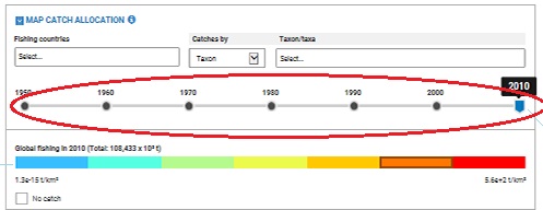
The first change was made to the “timeframe indicator,” which now allows you to change the year manually to every year between 1950-2010, without having to wait and update the map (image below).
Therefore, if you are looking for information on a specific year, whether it be where Japan caught yellowfin tuna in 1968, or where Canada caught cod in 1979, you can now search with greater specificity.
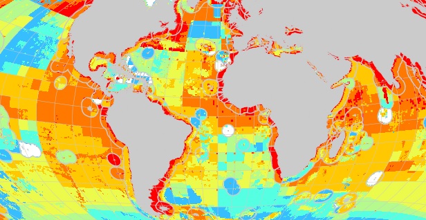
The second change was made to the color scheme. While the previous color palet showed a gradient of red, the new one shows a multi-color gradient.
This new color scheme provides greater clarity as to which areas of the ocean are heavily fished, compared to those where minimal fishing occurs.
Also, it just looks really good!
For those in government, academia or even NGO’s, this map provides a remarkable tool for understanding fish catch on a global scale.
We are aware that the data being displayed by this tool may contain errors or omissions, which is a common feature of global fisheries data. We continually update and validate these data, and appreciate any feedback regarding observed omissions and errors.