


Photo from MaxPixel, CC0.
The Sea Around Us data offered through this website are vast and complex and when large database queries are made, or multi-dimensional charts are rendered, our services may slow down or become unavailable.
Seeking to improve data access, avoid time delays, and provide a better user experience to enhance meaningful analysis and research, we have partnered with UBC Cloud Innovation Center (UBC CIC).
CIC is a public-private collaboration between UBC and Amazon. It identifies digital transformation challenges, the problems or opportunities that matter to the community, and provides subject matter expertise and CIC leadership.
Together, UBC-CIC and the Sea Around Us have developed a solution that uses Jupyter notebooks, our data, and AWS services using a server-less architecture. This approach is aimed at empowering users to execute complex data analyses and customized visualizations to communicate insights, in addition to alleviating the load of our website for obtaining similar results. The workflow of this solution is separated into two different scenarios (i) changes required when there is an update in underlying data (ii) day-to-day analysis workflow for a researcher.
The UBC CIC team built Jupyter notebooks templates with data analysis and visualizations examples, complete with the code behind charts and tables. Instructions are also added in the notebooks that explain the context and implementation details of the code blocks. User guides, additional documentation, and other reference material are provided in the GitHub repo to help the users understand the workflow easily, and to make changes as necessary for drawing insights from data.
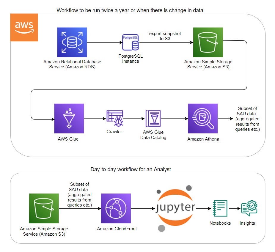
Architecture diagram
Technical Details
The solution aims to improve data access for researchers and offers a new way to interact with the SAU dataset using Jupyter notebooks to analyze, interpret and visualize the data. The team worked with the PostgreSQL database of SAU and the queries provided by the SAU data team.
As seen in the architecture diagram, the first part of the workflow involves exporting the Relational Database Service (RDS) snapshot of the SAU database (filtered to only the necessary tables) to S3 storage. The metadata is captured with the help of Glue crawlers, making queries possible. When the queries are run on Athena, CSV files are automatically generated in folders on S3. This is the subset of SAU data highlighted in the architecture diagram Day-to-day workflow for an Analyst. In the Day-to-day workflow, an analyst or a power user can load this subset of SAU data in S3 (via CloudFront) into Jupyter notebooks in any environment for further analysis and visualizations – easily generating insights from data. Jupyter notebooks that demonstrate different scenarios related to data analysis, visualizations, and data access are also included in the notebooks section of the Github repository.
Monitoring the solution utilization can be done via CloudFront statistics. Logs set up for the distribution can be used to monitor and analyze popular objects, usage by location, and to track the trends in requests and data transfer.
The solution enables researchers and analysts to perform data analysis or create custom visualizations as needed within the notebook itself, reducing and potentially replacing the need of using the SAU’s website for obtaining analytical information. More importantly, this solution has the potential of offloading 80% of customized data requests (8 customized data requests per month) from the Sea Around Us database team. Such requests usually come from scientific colleagues, members of the conservation community both national and international (for example, World Wildlife Fund and NGOs involved in SDG 14 Life Below Water), graduate students, and other researchers.
Link to the solution on GitHub: https://github.com/UBC-CIC/Sea-Around-Us