The most recent meeting of the Committee on Fisheries and Aquaculture (COFI) of the Food and Agriculture Organization of the United Nations (FAO) ended July 15 in Rome, and Dr. Dyhia Belhabib represented the Sea Around Us.
COFI is essentially the global parliament of fisheries. It is the only global inter-governmental forum where major international fisheries and aquaculture problems and issues are examined.
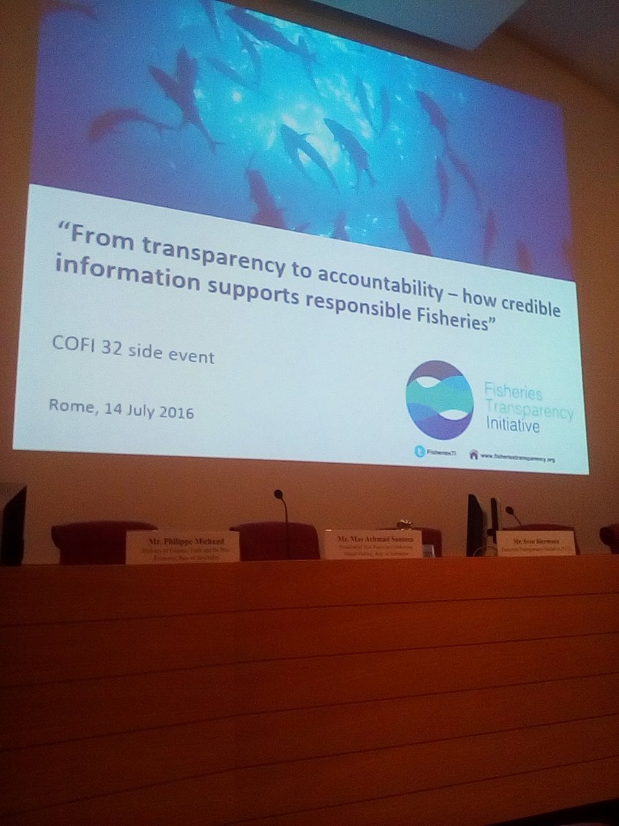
Dyhia also participated at a COFI side event where catch reconstructions were discussed between the FAO, the Sea Around Us, country representatives, staff from The Pew Charitable Trusts and Vulcan Inc., and other interested parties. This side event was sponsored by the governments of The Bahamas and The Gambia in collaboration with the Sea Around Us. It was a good opportunity for Dyhia to explain what catch reconstructions are, and why they are helpful to countries for improving their national data on fisheries catches.
Here is a summary of the Sea Around Us’ experiences at COFI and the associated side event:
This was the second time that Sea Around Us participated at COFI. And this time, we had a side event organized by FAO and co-sponsored by The Bahamas and The Gambia, in collaboration with the Sea Around Us.
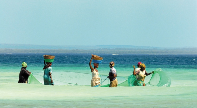
FAO strives for reliable catch statistics and they help countries in their data collection and capacity building. FAO relies heavily on statistics provided by countries. However, often some catch data are deemed to be non-existent simply because a country has no formal data collection program in place for certain aspects of fisheries, e.g., recreational fisheries or subsistence takes. This constrains the data FAO can report on behalf of these countries, leading to global statistics under-representing actual total catches, as clearly documented in a paper in Nature Communications by Daniel Pauly and Dirk Zeller in early 2016 [accessible here], and in other regional [e.g., Pacific islands, accessible here] and country-specific publications [example accessible here or here]. This is where the Sea Around Us with its catch reconstruction approach can contribute, by using reasonable and conservative methods to estimate those catches missing from official data collection programs.
Side event at COFI
The Sea Around Us submitted a proposal for a COFI side event co-sponsored by the governments of The Bahamas and The Gambia. The COFI organizing committee combined this proposal with a data event proposed by FAO. Thus, FAO kindly organized a combined side event, and Dyhia Belhabib was able to meet several FAO statistical staff, including Marc Taconet, Lucas Garibaldi and the new Director of the FAO Fisheries and Aquaculture Policy and Resources Division (FIA), Manuel Barange.
During the event, Dyhia had the impression that there were misconceptions and misunderstandings regarding the reconstruction methods that the Sea Around Us and the large number of our international collaborators use. This misunderstanding indicates to us that many of the people who quickly criticize a country’s catch reconstruction often seem not to have read the relevant papers and reports carefully to understand the methods and approaches used. To criticize that the methods used are not ‘proper’ or ‘relevant’ seems to also miss the fact that around 1/3 of all reconstructions have now been embedded in the scientific literature and have thus undergone independent and critical expert peer-review. Thus, it is not viable for the international fisheries statistical community to continue to disregard, ignore or downplay this growing body of global work.
Some other criticism that made the assumption that all the reconstruction work was done from Canada (where the Sea Around Us is headquartered) also points to a clear lack of proper prior research from those who raised this point. The Sea Around Us worked with over 400 co-authors from 200 countries. Dyhia’s work alone requires her to spend over 50% of her time working on active engagement with our partners in West Africa. The diversity of the panel participants, including from The Gambia and The Bahamas (apparently their first ever participation at COFI) talking about catch reconstructions was very informative by itself.
As part of our engagement, Dyhia also held direct discussions with FAO staff to hopefully help dispel the lingering misconceptions about the methods used to derive the reconstructed catch data. After all, we often are able to use classical catch data estimation methods to ‘reconstruct’ catches. For example, in The Gambia we merely multiply data on fishing effort by a typical catch assessed for that kind of effort. The Gambia is currently re-assessing its artisanal fisheries using the catch reconstruction method to submit to the FAO these new data, corrected backwards in time. Both The Gambia and The Bahamas will be following up by including data resulting from catch reconstructions as part of their next data submission to FAO, a huge step for the countries and for the Sea Around Us.
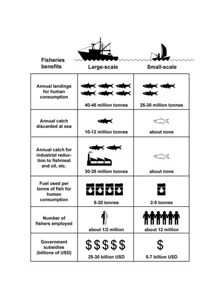
This also led to a conversation about separating catch data by major fisheries sectors, namely small-scale and large-scale, which the Sea Around Us has applied to all countries in the world, in part in support of the FAO Guidelines for Securing Sustainable Small-Scale Fisheries in the Context of Food Security and Poverty, which was adopted at the last COFI meeting. This led to a conversation with the FAO team on fishing effort, and we will follow up on this. Hopefully one day, regional fisheries bodies, scientists and the general public will be able to access official data separated by sector, and thus better contribute to the public resource debate. We are hopeful that we will be able to collaborate with and assist FAO in the future. After all, we strive for the same goals.
Finally, The Bahamas made a statement on the main floor of COFI in support of the importance of considering reconstructed data as an alternative to ‘nothing’ in data reporting schemes.
Conclusion
This year’s COFI in Rome allowed the Sea Around Us to work with the FAO, member countries, and NGO’s to better understand the importance of catch reconstructions, which can help fill data gaps and provide a more accurate and comprehensive historical baseline for fisheries catches.