
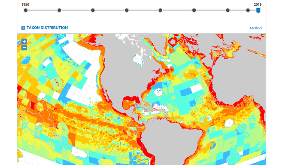
The video below shows the performance of one of the Sea Around Us most useful tools: the Mapped Data. By moving the lever from left to right, users can see how global fishing activity has expanded from 1950 to 2019.
The information that feeds the map come from the Sea Around Us’ database, which combines officially reported catches from the UN’s Food and Agriculture Organization (FAO) with carefully reconstructed estimates of what often goes unreported—like small-scale fisheries catches, discards, and bycatch. Together, these datasets help create a fuller picture of how much fishing actually happens, and where.
To place those catches on the map, our researchers use data about where different fish species live, based on global biodiversity information systems like FishBase and SeaLifeBase. Catches are then allocated across ocean grid cells to show patterns at a global scale.
While this approach is reliable for seeing big-picture trends—like the spread of fishing into deeper and more remote waters—it’s not meant to pinpoint the exact spot where every fish was caught. That’s why scale matters: these maps are best used to understand long-term pressure and global change, not individual fishing events.
If you would like to know more about our mapped data, feel free to email feedback(at)seaaroundus.org